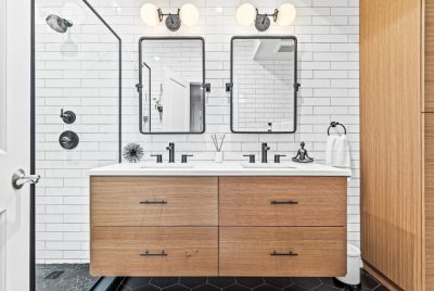
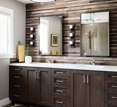
Whether you have the money to give your bathroom an entire overhaul or only want to change a few features, get some inspiration from the Japanese styling. Too much clutter brings the space down and makes everything look smaller. The fresh, clean lines that Japanese-style bathrooms bring can make any space feel larger and look brighter.
There is often a mixing of textures and colors of wood that we don’t normally see here, but works really well together. They also tend to bring greenery into the bathroom which also gives a bit of tranquility to a room where you definitely want to be relaxed in.
The use of softer curves mixed with the harsh edges brings an artistic appeal that doesn’t need much else in the way of decor in the room. It’s all about softer lighting and cleaner lines to have a space that is inviting and perhaps a bit too comfortable. You’ll need to leave eventually.
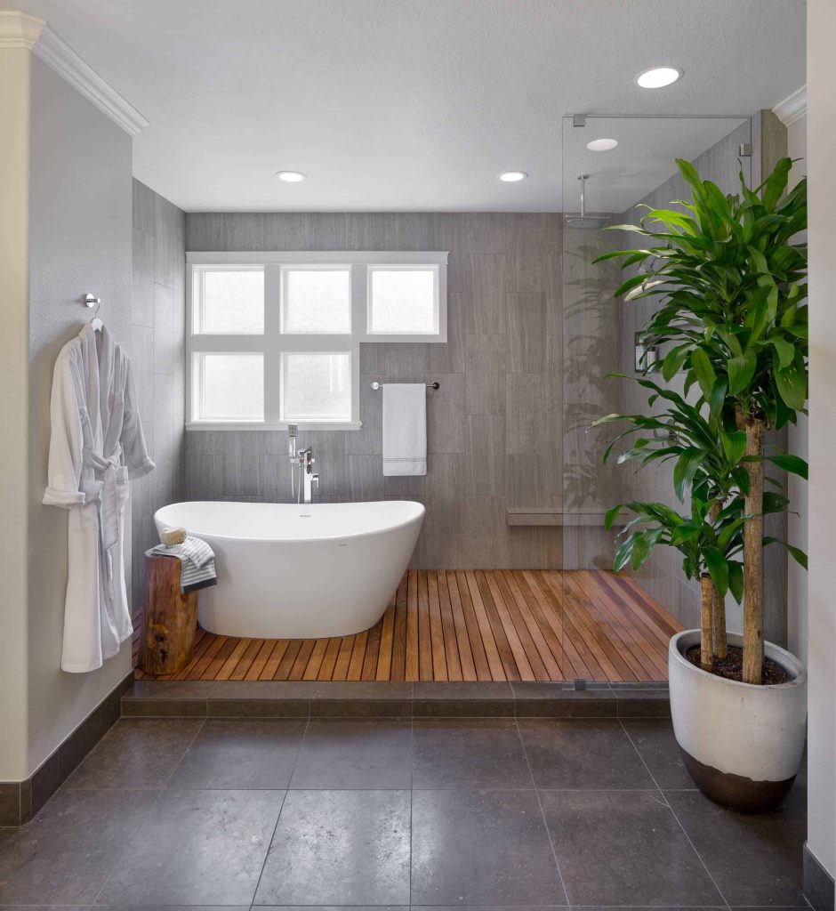
Light, bright, airy with a beautiful rounded white tub.
Rustic and outdoorsy, with a minimalistic look.
Fresh. clean lines from top to bottom
Having everything be all one color doesn’t mean it has to be boring. Using different textures, even in the same color, can still make it look fresh and different.
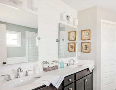
The square sink and round edges of the tub contrast beautifully.
I love when the fixtures don’t all match. Each piece can make its own statement if done simply.
Feels like a spa day with every bath.
The white oval tub leads to a wonderful view outside.
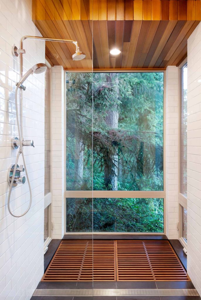
The best view in the house. Do not disturb.
The all-glass wall would normally scare me, but with that view I would never get out of the shower. I’d bring my kettle in there and have some coffee while looking at that beautiful scenery. If you don’t have neighbors, you have to have a glass wall in your bathroom.
8.Not only looks beautiful, but easy to keep clean.
The simple lines and minimal accessories give this Japanese bathroom idea a clean look but still looks stylish. You don’t need a lot of extras for a great look.
Earthy tones with square edges for a modern look.
Bringing in a bold piece like the tree that matches this tub idea is a way to tie the room together without needing a bunch of other stuff.
Feels like you are sitting outside.
The grays work well with the lighter wood finishes.
This is a bathroom you could stay in all day.
The mirrors on both sides of the Japanese style bathroom make it seem bigger. This is a great trick if you have a smaller, more narrow bathroom with a shower. If you have a window you can push your tub close to, you have to do it.
A very modern take with beautiful wood accent detailing.
The wood detailing ties it all together.
The gorgeous pebble flooring carries throughout.
The bright wood everywhere makes it feel so much bigger.
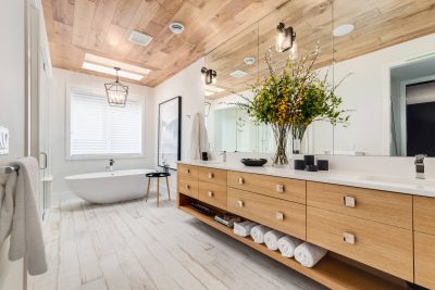
Usually not a fan of light rood, but this is done right. The subtle changes in shades are just enough to make this japanese bathroom design come to life.
The round tub is the beautiful focal point.
The calming water feature outside enhances the space.
If you ever have a chance to bring the outside in, it not only enlarges your space, but creates a breathtaking view. You just need to watch your water bill.
The plant gives the space a pop of color.
The Zen-like space’s textured walls are amazing.
If you aren’t afraid of letting the walls be the art, doing something like this can be all the decorating you need in the room.
Bright and minimalistic, the neutral tones are soothing.
The wood accents pop against the light tile.
The dark wood cabinet and bamboo accents have a calming feel.
The earthy green and browns really brings the outside in.
The way the tub is sitting on the stones and the antique vanity is so old world and calming.
The different tones of brown and wood bring a peaceful vibe.
Pebble flooring and green plants bring a tropical vibe.
The fun pathway to the tub brings a bit of joy and playfulness to the space.
The one wall of color really elevates the space.
It’s still keeping the space clean and clutter free by making one wall a beautiful statement.
A clean white tiled bathroom only needs a few accents.
The bamboo floor and ceiling in the shower really pop.
Separating the tub and dressing areas create some privacy.
The extra-large elevated tub is a great focal point.
The large circle tub in the center gives you a view of the whole space.
The lighting in between the wood beams gives a cool effect.
Experimenting with the lighting can really elevate your space with little to no extra cost.
Light is really used well to brighten the space.
The extra-long vanity top is amazing for holding your accessories.
The large, curved tub just begs to be filled.
The all-glass wall to the shower makes the room look so spacious.
The white walls and sink give it a sleek and clean look.
Immediately thinking of the ways to never leave this space
The contrast between colors and textures makes this space pop. You don’t always have to be so matchy matchy.
The white square tub and wood shelves create a beautiful contrast.
This one makes me think of Tetris, but in a good way.
Jungle vibes is the name of this space. Where’s George?
The darker tones make this small space seem to go on forever.
This small bathroom idea can be incredibly calming and inviting. The combination of the wood and dark colors allow for a truly unique experience that will make you feel relaxed every time you enter the room.
Nothing but sauna feelings from this.
It’s like showering in a rainstorm, but safely.
This has to be one of the most fun doorless walk in showers. It’s like a walk-through carwash and a rainstorm feature all in one.
All of the straight lines are strangely pleasing to the eye.
It’s like the lines are the artwork and you don’t need anything else.
The mixed tile and pebble combo looks so elegant.
I love two different textures in the walk-in shower. It’s always a fun and sophisticated look.
Always love a separate shower and tub where the tub has a view.
It’s simple, classic, clean, and fresh. Anyone would love this bathroom.
Even if we don’t fit in that tub, it looks really pretty.
The dark wall and darker wood play really well off each other.
Why does this make me think of the floor is lava? Love it!
The locker style hooks and bench seat is everything.
Sauna vibes, but make it elegant and sophisticated.
I just want to run my hands over that wood detailing.
Never thought I would want dark gray walls in a bathroom.

I always thought dark gray would make the space look smaller, but it is doing the opposite for me. It feels very airy and light even with the darker walls.
I need a closeup of that flooring asap
This shows that you don’t need a lot of clutter to decorate a space. The detail in the floor is all you need for it to pop.


