
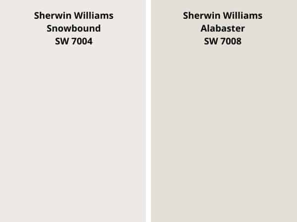
When I first decided to renovate my home, I knew I wanted a fresh, clean look. The walls needed a color that would brighten the space while still feeling warm and inviting. That’s when I discovered Sherwin-Williams’ Snowbound and Alabaster, two of the most popular white paint options.
At first glance, they seemed similar, but as I delved deeper, I realized how subtle differences in undertones and brightness could completely transform a room. Choosing the right shade became more than just a decision—it was an opportunity to create a space that truly reflected my style.
In this comparison, I’ll share my journey of selecting the perfect white paint for my home. Whether you’re looking for a crisp, modern feel or a softer, more timeless look, understanding the nuances between these two colors can make all the difference. Let’s explore what makes each shade unique and how they can elevate your space.
Key Takeaways
- Snowbound and Alabaster are two popular white paint colors from Sherwin-Williams.
- Subtle differences in undertones and brightness can transform a room’s atmosphere.
- Both colors are versatile for interior and exterior applications.
- Technical details like LRV (Light Reflectance Value) help in making informed decisions.
- Real-life examples from renovated rooms provide practical insights.
- Choosing the right white paint can enhance your home’s aesthetic and mood.
Overview of the Snowbound vs Alabaster Comparison
The subtle differences between white paint colors can make or break a room’s aesthetic. When I started my renovation, I quickly realized that not all whites are created equal. Two shades from Sherwin Williams—Snowbound and Alabaster—stood out, but their nuances were hard to spot at first glance. Understanding these differences became crucial to achieving the look I wanted.
Why This Comparison Matters
Choosing the right paint color is more than just picking a shade you like. It’s about how it interacts with natural light, complements your decor, and sets the mood of the space. Snowbound and Alabaster may seem similar, but their undertones and brightness levels can create entirely different atmospheres. This comparison helps you avoid costly mistakes and ensures your renovation reflects your vision.
Context in Today’s Home Renovation Trends
Modern home renovations favor crisp yet warm color palettes. Whites like Snowbound and Alabaster are perfect for achieving this balance. However, the direction your room faces—whether north or south—can dramatically affect how these colors appear. For example, a south-facing room with ample sunlight might highlight the warmth of Alabaster, while a north-facing space could bring out the cooler tones in Snowbound.
| Aspect | Snowbound | Alabaster |
|---|---|---|
| Undertone | Cool | Warm |
| Brightness | High | Moderate |
| Best for | Modern, crisp spaces | Warm, inviting rooms |
In my own home, I tested both shades in different rooms. The results were eye-opening. Snowbound gave my living room a clean, modern feel, while Alabaster made my bedroom cozy and timeless. Understanding these details not only saved me from repainting but also helped me create spaces that truly felt like home.
Understanding Key Color Characteristics
The magic of paint lies in its subtle undertones and brightness levels. When I started my renovation, I quickly realized that choosing the right white paint was more than just picking a shade. It was about understanding the science behind color and how it interacts with light and space.
Exploring Color Palettes and Undertones
Undertones are the hidden hues that give a color its personality. For example, a cool undertone might have hints of gray or blue, while a warm undertone leans toward yellow or beige. These subtle differences can dramatically change how a room feels.
In my experience, testing sample squares on different walls helped me see how these undertones played out in real life. One paint color might look crisp and modern in one room but feel too stark in another. This is why understanding undertones is crucial.
LRV and Brightness Levels Explained
Light Reflectance Value (LRV) measures how much light a color reflects. A higher LRV means a brighter, more reflective shade. For example, a white with an LRV of 83 will feel lighter and airier than one with an LRV of 82.
This metric is especially useful when choosing paint colors for rooms with limited natural light. A higher LRV can make a small space feel larger and more inviting.
| Aspect | Cool Undertone | Warm Undertone |
|---|---|---|
| Feel | Modern, crisp | Cozy, inviting |
| Best for | South-facing rooms | North-facing rooms |
| Example | Gray hints | Creamy beige |
By understanding these key characteristics, I was able to make informed decisions that transformed my home. Whether you’re aiming for a modern vibe or a timeless look, these insights can guide you to the perfect white paint.
Insights on Light Reflectance and LRV
Understanding how light interacts with paint transformed my renovation process. It’s not just about the color—it’s about how that color reflects light. This is where Light Reflectance Value (LRV) comes into play. LRV measures how much light a color reflects on a scale from 0 to 100. The higher the LRV, the brighter and more reflective the color appears.
For example, Sherwin Williams’ Snowbound has an LRV of 83, while Alabaster has an LRV of 82. That one-point difference might seem small, but it can significantly impact how a room feels. A higher LRV can make a space feel airy and open, while a slightly lower LRV can add warmth and depth.
Technical Analysis of Light Reflectance
LRV isn’t just a technical term—it’s a practical tool for homeowners. When I tested both paints in my home, I noticed how Snowbound’s higher LRV made my living room feel crisp and modern. In contrast, Alabaster’s slightly lower LRV gave my bedroom a cozy, timeless vibe.
Here’s how LRV affects brightness and mood:
- High LRV: Creates a bright, airy feel, ideal for small or dark spaces.
- Moderate LRV: Adds warmth without overwhelming the room.
Sherwin-Williams uses reliable testing methods to ensure their LRV values are accurate. This precision helps homeowners make informed decisions. For example, in a room with limited natural light, a higher LRV can make all the difference.
| Aspect | Snowbound (LRV 83) | Alabaster (LRV 82) |
|---|---|---|
| Brightness | High | Moderate |
| Best for | Modern, crisp spaces | Warm, inviting rooms |
Understanding light reflectance helped me plan my home makeover with confidence. It’s not just about picking a color—it’s about creating the right atmosphere. Whether you’re aiming for a bright, modern look or a cozy, timeless feel, LRV is a key factor to consider.
Exploring Undertones and Aesthetic Impact

The undertones of a paint color can completely transform the mood of a room. When I started my renovation, I quickly realized that understanding these subtle hues was key to achieving the desired atmosphere. Whether you’re aiming for a crisp, modern look or a cozy, timeless feel, the undertones play a crucial role.
Cool Undertone Effects
Cool undertones, like those found in shades with a gray undertone, create a crisp and modern ambiance. These colors often have hints of blue or pink, giving them a fresh and clean feel. In my living room, a cool undertone made the space feel open and airy, perfect for a contemporary design.
However, in rooms with limited natural light, cool undertones can feel stark. It’s essential to balance them with warm textures and furnishings to avoid a sterile look.
Warm Undertone Appeal
Warm undertones, such as those with a beige undertone, bring a sense of warmth and coziness to a space. These shades often lean toward creamy or yellow hues, making them ideal for traditional or inviting settings. In my bedroom, a warm undertone created a relaxing and timeless atmosphere.
Warm undertones are versatile and work well in rooms with ample natural light. They can also make smaller spaces feel more intimate and welcoming.
Creating the Right Mood in Your Space
Choosing the right undertone is about more than just color—it’s about creating the right mood. Here are some tips to help you decide:
- Experiment with samples: Test swatches in different lighting to see how the undertones change.
- Pair with textures: Combine cool undertones with soft fabrics or warm undertones with natural wood for balance.
- Consider room function: Use cool undertones in active spaces like kitchens and warm undertones in relaxing areas like bedrooms.
| Aspect | Cool Undertone | Warm Undertone |
|---|---|---|
| Feel | Modern, crisp | Cozy, inviting |
| Best for | South-facing rooms | North-facing rooms |
| Example | Gray hints | Creamy beige |
By understanding the impact of undertones, you can create spaces that truly reflect your style. Whether you prefer a modern vibe or a timeless look, these insights can guide you to the perfect paint color.
Application Across Different Rooms and Surfaces
Choosing the right paint for different surfaces in my home was a game-changer. It’s not just about the color—it’s about how it enhances each room and surface. From walls to cabinets, the right shade can elevate the entire space.
Ideal Interior Applications: Walls and Ceilings
For walls and ceilings, I found that a crisp, clean look works best in high-traffic areas. A cool undertone can make a living room feel modern and spacious. In my own home, I used this approach to create a bright, inviting atmosphere.
Ceilings painted in a lighter shade can make a room feel taller and more open. This technique worked wonders in my small hallway, giving it a sense of airiness.
Exterior, Cabinet, and Trim Uses
When it comes to exterior surfaces, durability and appearance are key. A warm undertone can make a home feel welcoming from the outside. I used this on my front door, and it instantly added curb appeal.
For cabinets and trim, a versatile shade can tie the whole room together. In my kitchen, I chose a creamy tone for the cabinets, which complemented the countertops beautifully. Here’s a quick comparison:
| Surface | Cool Undertone | Warm Undertone |
|---|---|---|
| Walls | Modern, crisp | Cozy, inviting |
| Cabinets | Clean, sleek | Timeless, warm |
| Exterior | Bright, fresh | Welcoming, classic |
By understanding these applications, I was able to transform my home into a cohesive, stylish space. Whether you’re painting a single room or the entire exterior, these insights can guide your decisions.
Design and Color Coordination Strategies
Creating a harmonious living space starts with thoughtful color coordination. When I began my renovation, I realized that pairing the right shades could transform a room’s atmosphere. Whether you’re aiming for a modern vibe or a timeless look, understanding how to blend colors is key.
Complementary Color Pairings for Modern Spaces
For a modern feel, I found that pairing crisp whites with cool blues and neutrals works wonders. These combinations create a clean, refreshing look that’s perfect for contemporary designs. In my living room, I used this approach to highlight the room’s natural light.
Here are some tips for pairing colors:
- Experiment with textures: Combine smooth surfaces with soft fabrics to add depth.
- Use accent colors: Add pops of bold hues to create focal points.
- Test samples: Always visualize how colors look in your space before committing.
Integrating Paint Colors with Your Decor
Integrating paint colors with your existing decor can be a game-changer. I discovered that warm tones pair beautifully with natural wood and earthy textures. In my bedroom, this combination created a cozy, inviting atmosphere.
Here’s how to balance colors and decor:
| Color | Best Pairings |
|---|---|
| Cool Whites | Blues, grays, metallic accents |
| Warm Whites | Browns, tans, natural wood |
By experimenting with these strategies, I was able to create spaces that felt both stylish and personal. Whether you’re renovating a single room or your entire home, these insights can help you make the perfect choice.
Evaluating Performance in Varying Lighting Conditions
Lighting can dramatically change how paint colors appear in your home. When I tested different shades, I was amazed at how the same color could look completely different under natural and artificial light. This made me realize how crucial it is to consider lighting when choosing paint.
Impact of Natural Versus Artificial Light
Natural light brings out the true essence of a color. In my living room, the bright white paint looked crisp and clean during the day. However, under artificial light, it took on a slightly warmer tone. This shift can make a big difference in how a room feels.
Artificial light, especially warm bulbs, can add a cozy vibe. But it can also make cool-toned paints appear less vibrant. Testing your paint under both lighting conditions is essential to avoid surprises.
South-Facing and North-Facing Room Considerations
South-facing rooms get plenty of natural light, which can enhance the warmth of certain paints. In my south-facing kitchen, the paint revealed subtle undertones that added depth to the space. However, in a north-facing room, the same color might look cooler and less inviting.
For darker spaces, choosing a bright white with a higher LRV can help balance the lack of natural light. In my north-facing bedroom, this approach made the room feel brighter and more open.
Here are some tips to optimize your paint’s appearance:
- Test samples: Paint swatches on different walls and observe them at various times of the day.
- Adjust lighting: Use a mix of natural and artificial light to create the desired mood.
- Consider room orientation: Choose colors that complement the direction your room faces.
By understanding how lighting affects paint, you can create spaces that look and feel just right. Whether you’re working with a bright room or a darker corner, these insights can guide your decisions.
Detailed Review: Snowbound vs Alabaster

Selecting the perfect white paint involves more than just picking a shade—it’s about understanding its impact on your space. In my journey, I compared Sherwin Williams Snowbound and Alabaster to uncover their unique strengths and weaknesses. Here’s a detailed review to help you make an informed choice.
Pros and Cons at a Glance
Every paint has its advantages and drawbacks. Here’s a quick breakdown of what I discovered:
- Sherwin Williams Snowbound: Offers a crisp, modern look with cool undertones. Ideal for bright, airy spaces but can feel stark in low-light rooms.
- Alabaster: Provides a warm, inviting vibe with creamy undertones. Perfect for cozy spaces but may appear too soft in well-lit areas.
Direct Comparison of Key Metrics
To truly understand these paints, I analyzed their technical metrics. Here’s how they stack up:
| Aspect | Snowbound | Alabaster |
|---|---|---|
| LRV | 83 | 82 |
| Undertone | Cool | Warm |
| Best for | Modern, crisp spaces | Cozy, timeless rooms |
In my home, Snowbound’s higher LRV made my living room feel bright and modern. Alabaster, on the other hand, added warmth to my bedroom. These subtle differences highlight the importance of choosing the right shade for each space.
By considering these factors, you can confidently select the paint that best suits your home’s aesthetic and lighting conditions. Whether you prefer a pure white or a softer tone, this comparison provides the insights you need to make the right choice.
Personal Insights on Choosing the Right White
Choosing the right white paint for my home felt like solving a puzzle—each piece had to fit perfectly. I wanted a shade that would brighten my space while reflecting my personal style. Through trial and error, I discovered that the best option often balances technical data with emotional appeal.
My Home Renovation Experience
In my living room, I tested a pure white with cool undertones. It created a crisp, modern look that I loved. However, in my bedroom, the same shade felt too stark. That’s when I switched to a warmer true white, which added a cozy, inviting vibe.
Lighting played a huge role in my decision. I noticed how natural light brought out the best in each color, while artificial light softened their tones. Testing samples in different rooms helped me see how each shade performed under varying conditions.
Tips for Making a Confident Decision
Here are some lessons I learned along the way:
- Test samples: Paint swatches on multiple walls and observe them at different times of the day.
- Consider room function: Choose brighter whites for active spaces and warmer tones for relaxing areas.
- Trust your gut: While technical details like LRV are helpful, your personal preference matters most.
For example, I initially hesitated to choose a bright white for my kitchen, fearing it might feel too cold. But after testing, I realized it was the perfect option to create a clean, fresh look.
Balancing technical insights with personal taste can be challenging, but it’s worth the effort. Whether you’re inspired by Benjamin Moore or another brand, the key is to experiment and find what works for your space. Trust your instincts—you’ll know the right choice when you see it.
Conclusion
The journey of selecting the perfect white paint taught me how subtle details can redefine a space. Whether it’s the cool undertones of one shade or the warmth of another, these nuances shape the mood of your home. Understanding LRV and how light interacts with color ensures your choice complements your room’s natural lighting.
Both Sherwin Williams options offer unique benefits. One brings a crisp, modern feel, while the other adds a timeless warmth. The key is to balance technical details with your personal style. Test samples, observe them in different lighting, and trust your instincts.
Your space deserves a look that reflects your vision. Whether you choose a pure white or a softer tone, informed decisions can transform your home into a place of beauty and comfort. Start your renovation journey today and create a timeless, inviting atmosphere.


